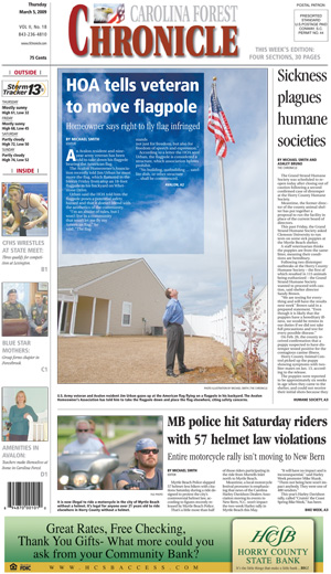
MICHAEL SMITH is an award-winning editor/designer from South Carolina. Despite all the accolades Michael has received, he’s always looking for ways to improve his work. Here, then, are more submissions from Michael for your review and comment.
Notes from Michael:

“March 5, 2009 – I wanted to illustrate the size of the flagpole in relation to the man, but the photos turned out average. A Photoshop trick allowed me to darken a section of the sky and clouds to accommodate the reverse while making a nifty photo illustration.
 April 2, 2009 – On this day, I had a big investigative piece about an interstate that doesn’t exist yet. Sometimes, large and simple is more effective. Hence, the I-73 sign with the question mark.
 April 9, 2009 – The first of many in-depth investigations of S.C. Accommodation taxes. This story, like the one that followed, was conducive to graphs.
 April 16, 2009 – Similar approach to April 9, 2009.”
Good pages here, Michael. Let’s see what others have to say. Comments, folks?

Can you tell me when text over screens is good, like Michael’s flag pole photo at the top, and when they’re questionable, like my two pages below?
I usually recommend against doing text over screens as a rule. Just because we can do it doesn’t mean we should. But if we’re going to, it’s important to keep the screen “neutral,” which Michael comes closer to on his page. It’s mostly all the same shade of blue. On your pages, the screens go from dark to light, white to red (though faded back). This forces the reader to read across different hues and saturation levels, making reading more difficult. It helps if we run the text in a larger type size, sans serif and bold. For example, I’d use Myriad Pro Bold at 12 point.
One other thing I noticed in the Play Ball package: The drop cap is indented. It’s not necessary to indent a drop cap. An indented drop cap is considered redundant typography.
I hope this helps.